The V&A’s East London museum, originally the ‘Museum of Childhood’, has undergone a rejuvenation that not only continues to preserve and document the history of childhood play across different cultures, but also inspires the next generation ‘with the power of creativity and agency’. The project was completed using a JCT Standard Building Contract.
The development of the Young V&A is the most significant chapter for its 150-year-old grade II* listed building since its original opening, when its frame and fabric were moved to its current location in Bethnal Green from South Kensington, where it was used during the 1851 Great Exhibition. Its latest upgrade celebrates and cleverly adapts its existing fabric whilst creating a space with an emphasis on accessibility and inclusivity. The base build and spatial rework was designed by De Matos Ryan (designers behind previous JCT case study, the Alice Hawthorn Pub), whilst the exhibit, display and fit-out work was designed by AOC.
The project team formed a ‘design cohort’ of children, teens, parents, and teachers, who all informed the design process and helped establish the priorities for the museum’s upgrade. Particular amongst these were that the experience of the visit could be built around the agency and interaction of the visitor – so an emphasis on accessibility, inclusivity, and flexibility of the spaces, and that, where possible, sustainable, low carbon and recycled materials should be used. The result is a brand-new set of highly colourful and interactive displays, rooms, and installations, incorporating both old and new exhibits.
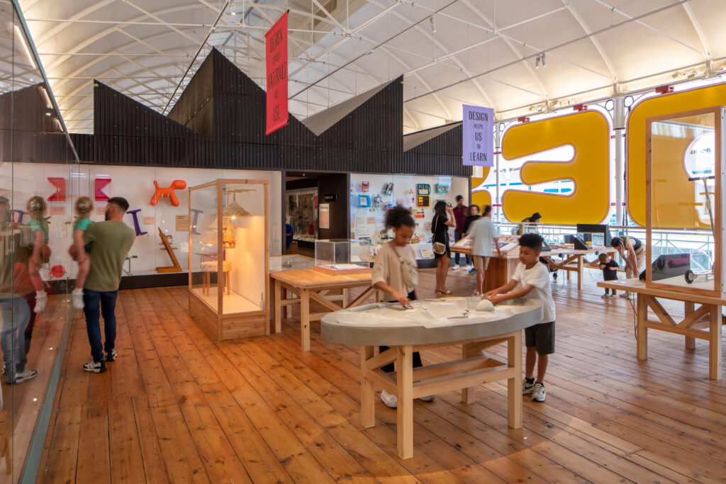
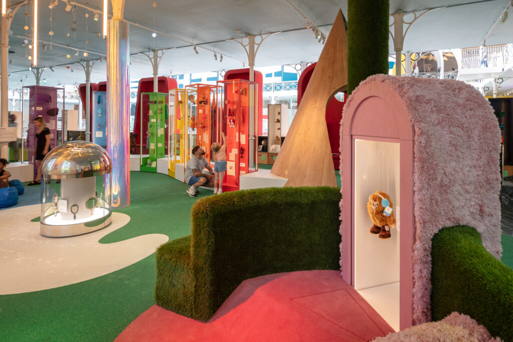
The AOC designed installations are organised into three permanent new galleries: ‘Play’, ‘Imagine’, and ‘Design’, each aimed at a different age group – babies, toddlers, and teens, respectively. AOC has employed imaginative use of colour and form, such as the signage developed with Graphic Thought Facility. These include large yellow and pink padded lettering announcing the ‘design’ gallery which also double as acoustic panels. Clever details in the display work incorporate features such as optical illusions, sensory playscapes, a giant marble run, a storytelling stage, a self-portrait making station, and a den building area. The teen group also has its own space to check phones, look at a display charting the history of video games, or interact with a virtual Young V&A built-in Minecraft game. Improvements have been made to circulation routes through the building and acoustics, with the galleries being designed around the needs of SEND, neurodivergent and disabled visitors. Interactive displays have adjustable volume levels and quiet spaces are implemented throughout.
Many exhibits from the original museum have been retained, including an 18th Century marionette theatre, ancient teddy bears, and a dolls house gallery which has been organised into an impressive multi-level ‘village’ display. The new curatorial approach expands on this however, with many of 1700 items drawn from the V&A’s 2.8m collection and beyond. New exhibits include a 2300BC Syrian rattle, a suit of Japanese samurai armour, a Microline car, as well as characters from the history of cartoons, games, and nostalgic toys, such as Barbie, Kermit the Frog, Teenage Mutant Ninja Turtles, Pokemon, Peppa Pig, and SpongeBob SquarePants. Other works, from artists, designers, and activists are also incorporated into the displays, from the likes of Virgil Abloh, Olafur Eliasson, Greta Thunberg, Bridget Riley, Miuccia Prada, Keith Haring, Issey Miyake, and David Hockney.
Sustainable and reusable materials are incorporated in a way that combines practicality with a quirky sense of fun, including recycled plastic plinths, benches made from yoghurt pots, old cupboard doors used as display surfaces, upcycled frames and display cases, terrazzo surfaces made from the building’s site rubble, and sustainable hemp fibre panelling.
In addition to the three permanent galleries, the renovation includes a suite of workshops and office spaces, as well as a purpose-built 515m2 gallery for temporary exhibitions, a new visitor shop and café.
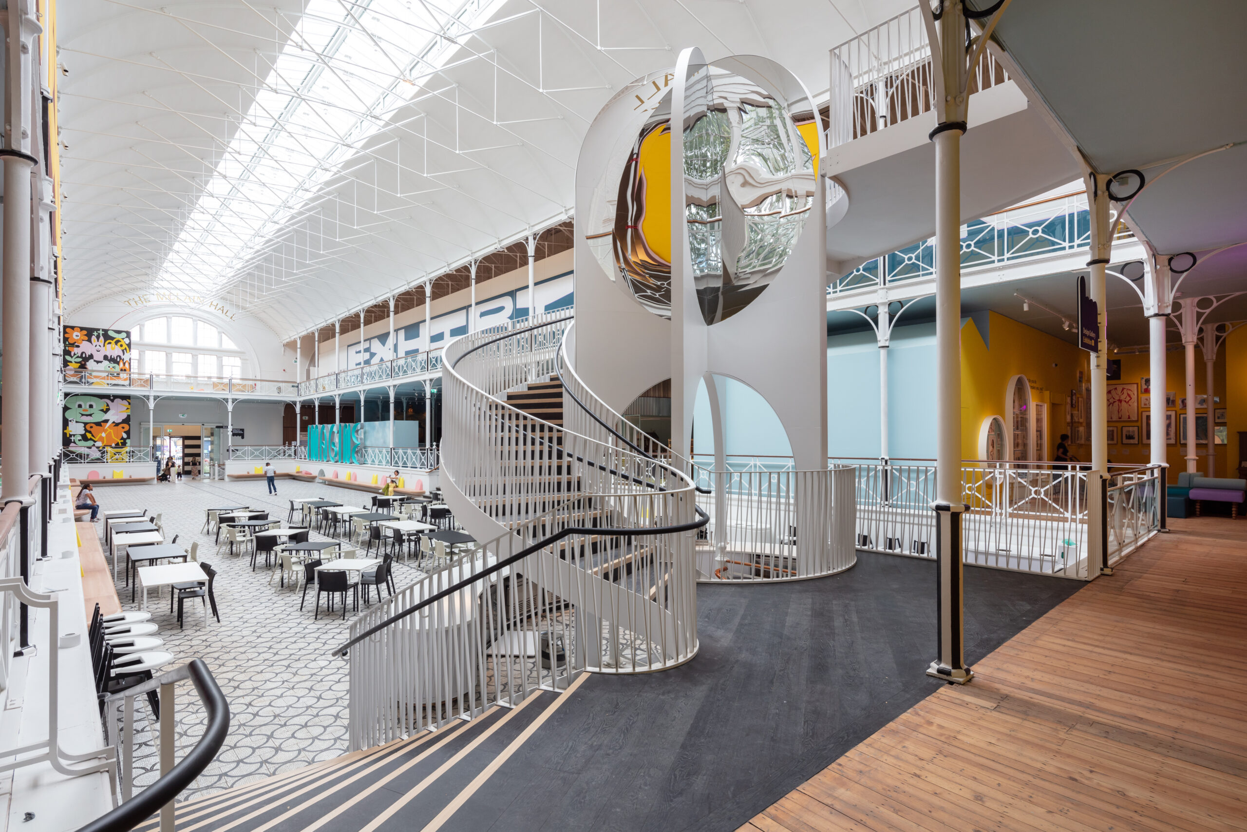
The De Matos Ryan designed works takes a subtler but no less bold approach to enable the gallery and display work to stand out. The works are designed to preserve and enhance the museum’s heritage as a grade II* listed building, and to treat new elements as distinctly modern but considered additions that respect that history. Similarly to AOC’s work on the galleries, De Matos Ryan’s design approach was organised along three themes: ‘in and out’ – improving the circulation with a second accessible entrance, and developing the outside space to be more welcoming and provide a more interactive experience, ‘up and down’ – installation of a new spiral staircase with optical effects to draw in visitors to each level, and ‘around and about’ – a plan to move the museum’s learning spaces throughout the displays, and move the library and archive to a more prominent location at the front of the building.
The approach to preserving and respecting the building’s heritage has been achieved by decluttering a lot of the main space, restoring a sense of the original volume, and revealing and reusing elements of the original fabric. Functioning roof lights in the barrel-vaulted roofs have been reinstated to flood the space with natural light. The shop and café have been moved back to create the sense of a ‘town square’, which has been paved with a fully revealed and restored 19th century marble mosaic floor. The building has been brought fully up to modern standards in terms of environmental control, and the project team undertook a ‘radical rethink’ of the fire safety strategy. Major structural work was undertaken in the basement, replacing the columns on the south side with transfer beams to create a large community room. A ‘Busby Berkeley’ style performance space with tiered stage and ‘road to nowhere’ set of steps has been creatively implemented by utilising an existing stair, blocked off at first floor level by the creation of the new temporary gallery space.
Outside, a new archway on the street provides a more welcoming entrance. Behind the 2006 front extension, the entrance has been opened up with a huge, but more environmentally efficient, pair of sliding doors. The view through these large doors at street level now presents the most eye-catching new addition, a kaleidoscopic spiral stair. It is a striking, sculptural feature that takes visitors up to all levels and contains in-built mirrors that distort your reflection as you move up and down.
It takes a careful balance to marry the mix of modern, colourful and bold design with the need to not only respect but fully celebrate a historic building’s fabric. This is especially challenging where the purpose of the building is to capture the imagination of children and be functional and accessible for a wide variety of visitors. The Young V&A has embraced this challenge transparently, fully engaging the end user and treating limitations as creative opportunities. Using the JCT Standard Building Contract provides a platform where this level of complexity can be encompassed, enabling a collaborative approach where parties can be confident of their approach.
Young V&A Project Data
Start: August 2021 (base-build started)
Completion: May 2023 (fit-out finished)
Gross internal floor area: 3,929m2
Gross (internal + external) floor area: 6,000m2
Contract: JCT Standard Building Contract
Construction cost: £9.8m
Client: V&A
Architect: De Matos Ryan (base build) and AOC Architects (fit out)
Main contractor: Quinn London and Factory Settings
Structural engineer: Price & Myers
M&E consultant: P3R
Quantity surveyor: Greenway
Lighting: Spiers & Major and ZNA
Graphics and wayfinding: Graphic Thought Facility
AV: Harmonic Kinetic
Interactives: Clay
Materials: Franklin Till
Access: Withernay Associates
Acoustic consultant: Gillieron Scott
Project manager: Lockerdell (PM)
Principal designer: Architects for their own packages
CDM coordinator: Jackson Coles
Approved building inspector: AIS
Funders: The McLain Foundation, Prue McLeod, Dunard Fund, Buffini Chao Foundation, The BAND Trust, Garfield Weston Foundation, Andrew Hochhauser KC, Oak Foundation, The Portal Trust, The Thompson Family Charitable Trust, Wolfson Foundation and many other supporters.
Photo credits:
Photo 1: Young V&A Feature Staircase © Luke Hayes courtesy of Victoria and Albert Museum, London
Photo 2: Young V&A, Design for Change, Design Gallery © Luke Hayes courtesy of Victoria and Albert Museum, London
Photo 3: Young V&A, Play Gallery, view across the Mini Museum © Luke Hayes courtesy of Victoria and Albert Museum, London


