With a clutch of awards, including a RIBA National Award 2015, the 2015 Art Fund Prize for Museum of the Year, and shortlisted for the RIBA Sterling prize, the extension to the Whitworth Gallery in Manchester is a masterpiece of transparency and integration with its exterior parkland space. A JCT Standard Building Contract provided the contract solution.
The University of Manchester’s Whitworth Gallery first opened in 1908, and was designed by J.W. Beaumont. The north-south facing façade is the original red brick and terracotta, neo-Jacobean style, with a semi-circular raised entrance. The collection, still housed in the original building, contains one of the world’s best textile collections, dating back to the third century. Additional pieces range from Turner to Bacon, Freud, Peter Blake, Bridget Riley and contemporary works.
The western extension to the Gallery commenced in 2012, necessitated by a doubling of visitor numbers since 2005, and a requirement to properly house and store its collections of more than 55,000 objects on-site. The brief from client, University of Manchester Estates, was to make the Gallery’s internationally renowned collection of art, textiles and wallpaper accessible to a wider range of visitors, make better use of existing space, and establish a relationship between the building and the surrounding grounds and park.
The key factor in establishing a link between the building and its surroundings was developing the building’s concept of transparency – both physically and emotionally. A greater sense of exploration is encouraged by breaking perceived psychological barriers between the traditional Victorian-Edwardian entrance and the unarticulated rear of the building. Physically, it was important for the gallery spaces within the new extension to be viewable from the park and vice-versa.
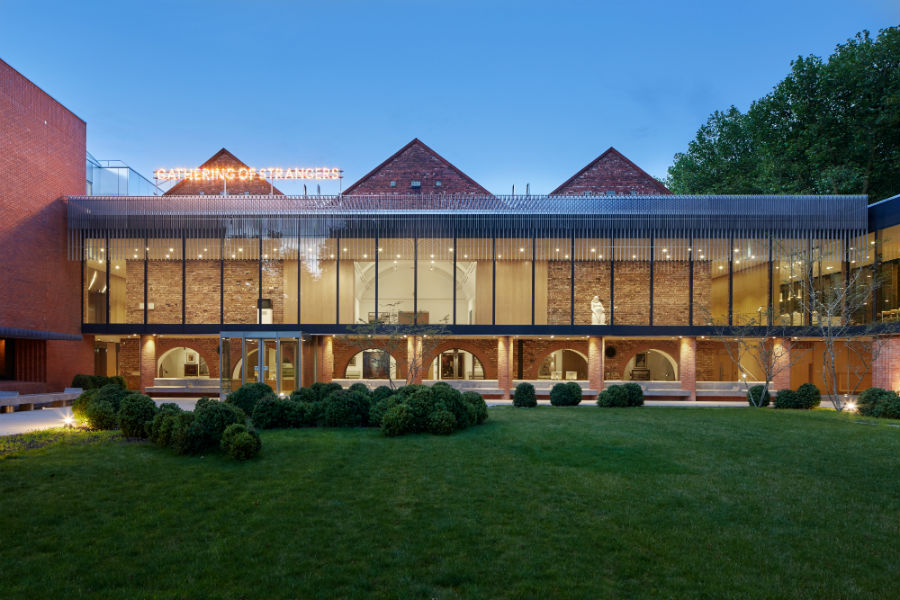
What was empty space beyond the western brick wall now forms a promenade around its three sides, paved with Purbeck stone. The promenade section facing west is wide open to the park through a full-height, full-width screen of glazing. Stainless steel mullions that reflect trees and sky vertically divide the glass,beyond which bead-blasted 5mm thick fins form a continuous fringe of brise-soleil. A storey below, a new courtyard garden space – the Art Garden, is enclosed by new extensions, two volumes which push out asymmetrically into the parkland. The left of these houses the new café. This was achieved without the loss of a single mature tree, just one bush which needed to be relocated.

The old suspended ceilings in the rear western space have been removed and barrel vaulted ceilings, each with two rows of skylights, look down from under the long pitched roofs. The northern space becomes the third of three parallel galleries. The central of these has full height oak doors that slide open to provide a transparent, living frame of the park.
The north wing is a shorter extension, but larger overall. The lower ground floor echoes the existing traditional building with solid red brick but adds a contemporary touch with a single long horizontal window. This wing houses the new Landscape Gallery (for land art and sculpture). The floor can take a point load of 7.5 tonnes, or a distributed load of 10 tonnes. The ceiling height is 5.5m. Opposite the Landscape Gallery entrance is the small but tall conservation Room, which contains a tapestry hoist. It has a higher ceiling than the Landscape Gallery at 7.5m.
At 40m in total length, the café extends from its servery end into a completely glassed 28.5m length for seating. The last 4.5m floats out on a cantilever that hangs from cross-bracing in the roof. Purbeck stone flooring and steel mullions feature once again. The glass is fritted high up with vertical lines that become double density at the top.
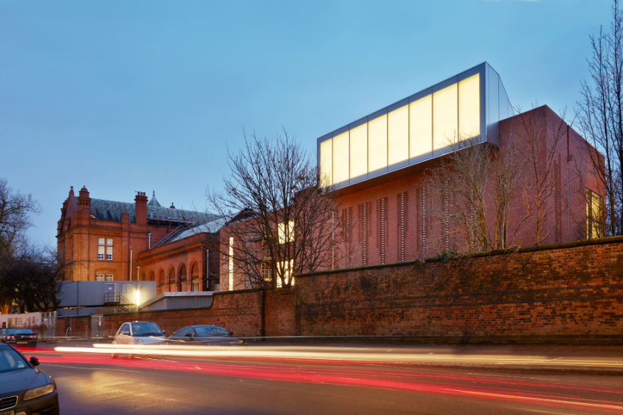
Natural light is diffused via a new long northern skylight. The extension blends with its existing urban edge with red brick and terracotta, but on the northern side the skylight pitches out of the brick building’s roof edge – an unexpected and bold white construction that houses a large light scoop.
The desire for transparency and the choice of materials used on the Whitworth project has helped to open the site, dissolving the barriers between the park and the gallery. The effect of this is not only where the gallery itself extends into the parkland, but is achieved with a lot more depth internally, where interval sight-lines in the galleries and promenades open up. The use of metal, glass, stone and wood makes for a natural, warm palette, more welcoming than the usual gallery white. It makes for a neutral backdrop, neither competing visually with the exhibits or the parkland.
For a project whose brief was focused on transparency and defining clear relationships, it is appropriate that the JCT Standard Building Contract With Quantities was the contract of choice. The JCT Standard Building Contract is one of the industry’s most widely recognised forms, used when clearly defined terms, clear distinction between various roles and responsibilities and an accurate provision of design and bills of quantities is desired at the outset. With the choice of contract, like the project itself, it is transparency all round.

The New West Elevation and Art Garden Court. Photo: Alan Williams

